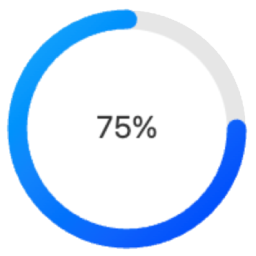
Circle Progress Bar Block
Circle Progress Bar Block is a modern Gutenberg block plugin that adds beautiful circular progress indicators to your WordPress site. Perfect for displaying progress, statistics, or metrics in a visually appealing way. Source Code All uncompiled source code is included in this plugin. The production code in build/index.js is compiled from: Main Source File Located at src/index.js, this is the complete React source code for the block: `javascript import { registerBlockType } from ‘@wordpress/blocks’; import { InspectorControls } from ‘@wordpress/block-editor’; import { PanelBody, RangeControl, ColorPicker, TextControl, SelectControl, } from ‘@wordpress/components’; registerBlockType(‘circle-progress-bar/progress’, { title: ‘Circle Progress Bar’, icon: ‘chart-pie’, category: ‘widgets’, description: ‘A customizable circle progress bar.’, keywords: [‘progress’, ‘circle’, ‘chart’], supports: { html: false }, attributes: { percentage: { type: ‘number’, default: 75 }, size: { type: ‘number’, default: 100 }, strokeColor: { type: ‘string’, default: ‘#00aaff’ }, bgColor: { type: ‘string’, default: ‘#e6e6e6’ }, text: { type: ‘string’, default: ‘Progress’ }, useShadow: { type: ‘boolean’, default: false }, useGradient: { type: ‘boolean’, default: false }, strokeWidth: { type: ‘number’, default: 10 }, fontSize: { type: ‘number’, default: 20 }, fontColor: { type: ‘string’, default: ‘#333’ } }, // Full source code available in src/index.js // See GitHub repository for complete implementation }); Build Tools The production code is generated using standard WordPress tools: * @wordpress/scripts – For development and build * Webpack – For module bundling * Babel – For modern JavaScript compatibility Building from Source The source is in src/index.js Build tools are configured in package.json To compile: bash npm install npm run build Output goes to build/index.js Directory Structure To work with the source code: 1. Clone the GitHub repository: https://github.com/jqsafi/circle-progress-bar 2. Install dependencies: npm install 3. Start development server: npm start 4. Build production version: npm run build Features Fully Customizable Design Adjustable circle size and stroke width Custom colors for progress bar, background, and text Optional gradient effects Configurable font size and text Shadow effects available Block Editor Integration Easy to use block controls Live preview in editor Works with Full Site Editing (FSE) Multiple instances support Performance Optimized Lightweight SVG-based rendering No external dependencies Optimized for modern browsers Usage Basic Configuration After adding the block, set your desired percentage (0-100) in the block settings panel Customize the appearance: Change circle size using the “Size” slider Adjust stroke width using the “Thickness” slider Set colors for the progress bar, background, and text Enable/disable gradient effect Add custom text above or below the percentage Advanced Features Shadow Effects: Enable and customize shadow effects in the “Effects” panel Text Options: Configure font size, weight, and position Development The Circle Progress Bar Block is developed using modern JavaScript and follows WordPress coding standards. The source code is available on GitHub: GitHub Repository: https://github.com/jqsafi/circle-progress-bar Building from Source Clone the repository Install dependencies: npm install For development with live reload: npm start For production build: npm run build The plugin uses the following build tools: * @wordpress/scripts for development and build processes * webpack for bundling * Babel for JavaScript transpilation * ESLint and Prettier for code formatting Source files are located in: * src/ – Uncompiled JavaScript source code * build/ – Compiled and minified production code
Top keywords
- build13×2.56%
- source12×2.37%
- code11×2.17%
- progress11×2.17%
- default10×1.97%
- type10×1.97%
- block8×1.58%
- npm8×1.58%
- wordpress8×1.58%
- circle7×1.38%
- source code7×1.38%
- bar6×1.18%
Ultimate Blocks – 25+ Gutenberg Blocks for Block Editor
Get Pro | Documentation Ultimate Blocks is a free powerhouse for bloggers and content marketers using WordPress. It’s not just a plugin, it’s a toolkit to skyrocket user engagement and simplify content creation. With Ultimate Blocks, you’re not just adding functionalities; you’re crafting experiences. From interactive content filters, captivating call-to-actions, to social sharing made effortless, every block is a step towards a more engaging and visually appealing website. It’s about making every visit count, every interaction memorable, and every content piece a breeze to create and manage. Transform your WordPress journey; let Ultimate Blocks be the catalyst for your website’s success. Ultimate Blocks currently includes the following blocks: Coupon (Available in Pro) – View Demo Timeline (Available in Pro) – View Demo Content Filter – View Demo Review (Schema Markup Enabled) – View Demo HowTo Schema – View Demo Table of Contents – View Demo Tabbed Content – View Demo Call to Action – View Demo Content Toggle (Accordion) – View Demo Styled Box – View Demo Styled List – View Demo Expand – View Demo Testimonial – View Demo Click to Tweet – View Demo Social Share – View Demo Countdown – View Demo Progress Bar – View Demo Post Grid – View Demo Star Rating – View Demo Image Slider – View Demo Button (Improved) – View Demo Divider – View Demo We have more exciting blocks in the making. Have a suggestion? Let us know. Join Us To Get Updates and Resources Visit Ultimate Blocks Website Follow Us on Twitter Join Our Support Community Join Our Facebook Group More Info About the Blocks Content Filter Content Filter lets your visitors filter the content based on different filters. You can let your users go through your content more easily. Review Block Add a review block with product name, features, summary, button and star rating. It is Schema Markup enabled. HowTo Schema Block Add HowTo Schema with sections, steps and valid schema data. Table of Contents Block Generate a table of contents from your headings. Tabbed Content Block Add content in tabs in your posts/pages. This comes with a nice drag and drop feature to sort the tabs. Call to Action Block Add a nice call to action box with a button. Encourage users to take action, engage more. You can customize everything in the block. Content Toggle Add contents in accordions. Let visitors expand them and show the content. Styled Box Block Add styled box like – Notification box, Number box, Feature box in your content. Three templates now, more in the making. Styled List Block This block lets you add a styled list in your post or pages. Instead of bullets you can use various icons as your list style type. You can also choose color for icons. Expand Block Expand Block lets you add expandable content. You can hide some part of your content initially. Upon clicking on ‘Show More’ it will show. It can be hidden again. Testimonial Block Nice, simple testimonial box with option to add image, name, role of the testimonial author. Click to Tweet Add tweetable content in your posts/pages. Social Share Block Add social share buttons in your posts and pages with this blocks. It comes with lots of customization options too. Countdown Block Add a countdown in your post/pages. Comes with three different styles. Progress Bar Block Add Cirle/Line Progress bar with this blocks. Comes with options to change thickness, color. Post Grid Block Add a list or grid of your posts. Comes with options to change categories, order and many more. Star Rating Block Add Star ratings in your posts/pages. You can customize size, color, numbers of stars. Image Slider Block Add a lightweight, simple image slider in your post. Comes with additional settings. Button Block Button block with more customization options and controls. Divider Block Add custom divider between your blocks. Customize the color, size, everything. Other tools from us Tableberg: The Best WordPress Block Table Plugin to create beautiful and responsive tables. GroundWP: Lightweight and Minimal Block Theme for efficient Full-Site Editing.