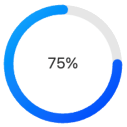
Circle Progress Bar Block
Circle Progress Bar Block is a modern Gutenberg block plugin that adds beautiful circular progress indicators to your WordPress site. Perfect for displaying progress, statistics, or metrics in a visually appealing way. Source Code All uncompiled source code is included in this plugin. The production code in build/index.js is compiled from: Main Source File Located at src/index.js, this is the complete React source code for the block: `javascript import { registerBlockType } from ‘@wordpress/blocks’; import { InspectorControls } from ‘@wordpress/block-editor’; import { PanelBody, RangeControl, ColorPicker, TextControl, SelectControl, } from ‘@wordpress/components’; registerBlockType(‘circle-progress-bar/progress’, { title: ‘Circle Progress Bar’, icon: ‘chart-pie’, category: ‘widgets’, description: ‘A customizable circle progress bar.’, keywords: [‘progress’, ‘circle’, ‘chart’], supports: { html: false }, attributes: { percentage: { type: ‘number’, default: 75 }, size: { type: ‘number’, default: 100 }, strokeColor: { type: ‘string’, default: ‘#00aaff’ }, bgColor: { type: ‘string’, default: ‘#e6e6e6’ }, text: { type: ‘string’, default: ‘Progress’ }, useShadow: { type: ‘boolean’, default: false }, useGradient: { type: ‘boolean’, default: false }, strokeWidth: { type: ‘number’, default: 10 }, fontSize: { type: ‘number’, default: 20 }, fontColor: { type: ‘string’, default: ‘#333’ } }, // Full source code available in src/index.js // See GitHub repository for complete implementation }); Build Tools The production code is generated using standard WordPress tools: * @wordpress/scripts – For development and build * Webpack – For module bundling * Babel – For modern JavaScript compatibility Building from Source The source is in src/index.js Build tools are configured in package.json To compile: bash npm install npm run build Output goes to build/index.js Directory Structure To work with the source code: 1. Clone the GitHub repository: https://github.com/jqsafi/circle-progress-bar 2. Install dependencies: npm install 3. Start development server: npm start 4. Build production version: npm run build Features Fully Customizable Design Adjustable circle size and stroke width Custom colors for progress bar, background, and text Optional gradient effects Configurable font size and text Shadow effects available Block Editor Integration Easy to use block controls Live preview in editor Works with Full Site Editing (FSE) Multiple instances support Performance Optimized Lightweight SVG-based rendering No external dependencies Optimized for modern browsers Usage Basic Configuration After adding the block, set your desired percentage (0-100) in the block settings panel Customize the appearance: Change circle size using the “Size” slider Adjust stroke width using the “Thickness” slider Set colors for the progress bar, background, and text Enable/disable gradient effect Add custom text above or below the percentage Advanced Features Shadow Effects: Enable and customize shadow effects in the “Effects” panel Text Options: Configure font size, weight, and position Development The Circle Progress Bar Block is developed using modern JavaScript and follows WordPress coding standards. The source code is available on GitHub: GitHub Repository: https://github.com/jqsafi/circle-progress-bar Building from Source Clone the repository Install dependencies: npm install For development with live reload: npm start For production build: npm run build The plugin uses the following build tools: * @wordpress/scripts for development and build processes * webpack for bundling * Babel for JavaScript transpilation * ESLint and Prettier for code formatting Source files are located in: * src/ – Uncompiled JavaScript source code * build/ – Compiled and minified production code
Top keywords
- build13×2.56%
- source12×2.37%
- code11×2.17%
- progress11×2.17%
- default10×1.97%
- type10×1.97%
- block8×1.58%
- npm8×1.58%
- wordpress8×1.58%
- circle7×1.38%
- source code7×1.38%
- bar6×1.18%
Sidocode Shipping Goal Tracker for WooCommerce
Sidocode Shipping Goal Tracker for WooCommerce is a lightweight, high-performance plugin designed to boost your store’s sales by surfacing free shipping incentives exactly where they matter. Surveys show that free shipping is the number one driver for online purchases. This plugin doesn’t just tell customers how much they need to spend; it visualises their progress in real-time, encouraging them to add “just one more item” to unlock their reward. Key Features Dynamic Progress Bar: A sleek, animated bar that updates instantly via AJAX as customers add or remove items from their cart. Proximity-Based Smart Messages: Automatically switches messages based on how close the customer is (e.g., “Add £20 more”, “You’re only £5 away!”, “🎉 Free shipping unlocked!”). Integrated Upsells: Show global hand-picked products or WooCommerce native upsells directly below the progress bar to help customers reach the threshold faster. Flexible Placement: Position the bar automatically on product pages, cart pages, or use the shortcode for custom locations. Full Customisation: Control colours, font sizes, border radius, bar height, and icons directly from the settings page. High Performance: Built with vanilla JavaScript and native WooCommerce hooks. No heavy libraries or bloated code. HPOS Compatible: Fully supports WooCommerce High-Performance Order Storage (HPOS). Developer Friendly: Overridable templates and clean hooks for deep customisation. Shortcodes [ssgt_bar] – Displays the shipping bar. force="1": Use this inside page content if the bar is already appearing via an automatic hook but you want it to show again.
Top keywords
- bar8×3.29%
- shipping5×2.06%
- woocommerce4×1.65%
- add3×1.23%
- customers3×1.23%
- progress3×