Better Block Editor (BBE)
Better Block Editor (BBE) adds responsive layout controls, hover effects, on-scroll animations, and ready-to-use site templates to Block Editor. It’s not another page builder. It doesn’t replace core blocks or add bloat — BBE just adds the missing settings where needed. It works with your current block theme and plugins, so your existing content stays intact. Highlights Responsive Settings for Row, Stack, Grid, Columns, Button, Navigation, and text (Heading, Paragraph) blocks — choose a breakpoint, then adjust orientation, spacing, and alignment at that breakpoint. Responsive Visibility for any block — set the default visibility state and change it at a chosen breakpoint. Prevent Shrinking for elements set to Fixed or Fit-content sizes — keeps complex layouts intact on small screens. Animation on Scroll — configurable animation effect, easing, duration, and delay. Hover colors for Button and Navigation. Pre-made Sites and Partial Import — bring over a full site or a single page/section; assets import automatically. One-click customization for imported content — set primary, secondary, and neutral colors; BBE creates a balanced palette in one click. Native Block Editor integration — no lock-in, lightweight, GPL, and free. Free pre-made site templates Business — https://templates.wpbbe.io/business/ Brewery — https://templates.wpbbe.io/brewery/ Life Coach — https://templates.wpbbe.io/life-coach/ Bakery — https://templates.wpbbe.io/bakery/ More templates coming soon. How it works Import a template and make it yours in minutes with the one-click customization tool. Mix pages and sections from different templates with Partial Import. Create a professional website in hours — not weeks! Features Responsive Settings for Row and Stack — change orientation (convert Row ↔ Stack), justification, vertical alignment, and spacing at a chosen breakpoint. This panel is key to controllable responsive behavior in Block Editor sites. Prevent Shrinking — available when a block’s width/height is set to Fit content or Fixed; prevents fixed-size elements from collapsing on small screens. Responsive Visibility for any block — set the default visibility state (visible/hidden) and change it at a chosen breakpoint. Responsive Settings for Grid — replaces the core Stack on mobile with a dedicated panel to choose the stacking breakpoint and adjust spacing at that breakpoint. Improved Stack on mobile for Columns — choose the breakpoint and optionally reverse the column order at that breakpoint. Navigation overlay menu — replaces the fixed Mobile option with Responsive; pick the exact breakpoint when navigation collapses to a menu icon (useful for headers). Hover color for Navigation — add hover color controls for menu and submenu items. Responsive Settings for Button — control the orientation of inner buttons (stack or reverse), plus justification and vertical alignment at a chosen breakpoint. Hover colors for Button — set text, background, and border colors on hover. Responsive Settings for Post Template (Grid view) — stack posts and adjust spacing at a chosen breakpoint. Animation on Scroll for any block — subtle reveal on scroll with configurable effect, easing, duration, and delay. Responsive text alignment — add alignment controls at a chosen breakpoint for Heading, Paragraph, and select text-based blocks. SVG Icon block + sanitized SVG upload — place SVG icons anywhere; control size, color, hover color, and linking. Breakpoints — edit built-in breakpoints and add or remove custom breakpoints. Requirements & Compatibility WordPress 6.8 or later Uses the native Block Editor (Gutenberg) Works with block themes; does not target third-party page builders Privacy This plugin does not collect personal data from site visitors. It uses standard Block Editor controls and optional template imports. Site owners should review their own analytics/embeds for compliance. License Better Block Editor is distributed under the GPLv2 or later. You are free to use it on personal and commercial sites. Resources Official website — https://wpbbe.io/ User Guide — https://docs.wpbbe.io/
Top keywords
- block14×2.32%
- breakpoint13×2.15%
- responsive11×1.82%
- templates8×1.32%
- block editor7×1.16%
- editor7×1.16%
- hover7×1.16%
- stack7×1.16%
- chosen6×0.99%
- chosen breakpoint6×0.99%
- https6×0.99%
- io6×0.99%
Circle Progress Bar Block
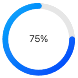
Circle Progress Bar Block is a modern Gutenberg block plugin that adds beautiful circular progress indicators to your WordPress site. Perfect for displaying progress, statistics, or metrics in a visually appealing way. Source Code All uncompiled source code is included in this plugin. The production code in build/index.js is compiled from: Main Source File Located at src/index.js, this is the complete React source code for the block: `javascript import { registerBlockType } from ‘@wordpress/blocks’; import { InspectorControls } from ‘@wordpress/block-editor’; import { PanelBody, RangeControl, ColorPicker, TextControl, SelectControl, } from ‘@wordpress/components’; registerBlockType(‘circle-progress-bar/progress’, { title: ‘Circle Progress Bar’, icon: ‘chart-pie’, category: ‘widgets’, description: ‘A customizable circle progress bar.’, keywords: [‘progress’, ‘circle’, ‘chart’], supports: { html: false }, attributes: { percentage: { type: ‘number’, default: 75 }, size: { type: ‘number’, default: 100 }, strokeColor: { type: ‘string’, default: ‘#00aaff’ }, bgColor: { type: ‘string’, default: ‘#e6e6e6’ }, text: { type: ‘string’, default: ‘Progress’ }, useShadow: { type: ‘boolean’, default: false }, useGradient: { type: ‘boolean’, default: false }, strokeWidth: { type: ‘number’, default: 10 }, fontSize: { type: ‘number’, default: 20 }, fontColor: { type: ‘string’, default: ‘#333’ } }, // Full source code available in src/index.js // See GitHub repository for complete implementation }); Build Tools The production code is generated using standard WordPress tools: * @wordpress/scripts – For development and build * Webpack – For module bundling * Babel – For modern JavaScript compatibility Building from Source The source is in src/index.js Build tools are configured in package.json To compile: bash npm install npm run build Output goes to build/index.js Directory Structure To work with the source code: 1. Clone the GitHub repository: https://github.com/jqsafi/circle-progress-bar 2. Install dependencies: npm install 3. Start development server: npm start 4. Build production version: npm run build Features Fully Customizable Design Adjustable circle size and stroke width Custom colors for progress bar, background, and text Optional gradient effects Configurable font size and text Shadow effects available Block Editor Integration Easy to use block controls Live preview in editor Works with Full Site Editing (FSE) Multiple instances support Performance Optimized Lightweight SVG-based rendering No external dependencies Optimized for modern browsers Usage Basic Configuration After adding the block, set your desired percentage (0-100) in the block settings panel Customize the appearance: Change circle size using the “Size” slider Adjust stroke width using the “Thickness” slider Set colors for the progress bar, background, and text Enable/disable gradient effect Add custom text above or below the percentage Advanced Features Shadow Effects: Enable and customize shadow effects in the “Effects” panel Text Options: Configure font size, weight, and position Development The Circle Progress Bar Block is developed using modern JavaScript and follows WordPress coding standards. The source code is available on GitHub: GitHub Repository: https://github.com/jqsafi/circle-progress-bar Building from Source Clone the repository Install dependencies: npm install For development with live reload: npm start For production build: npm run build The plugin uses the following build tools: * @wordpress/scripts for development and build processes * webpack for bundling * Babel for JavaScript transpilation * ESLint and Prettier for code formatting Source files are located in: * src/ – Uncompiled JavaScript source code * build/ – Compiled and minified production code