Shortcodes Ultimate – Content Elements
Building new pages with Gutenberg? Explore VovaBlocks, a focused collection of native marketing and content blocks from the creator of Shortcodes Ultimate. View VovaBlocks → About Shortcodes Ultimate Shortcodes Ultimate is a WordPress shortcode plugin for adding tabs, accordions, buttons, FAQs, sliders, carousels, lightboxes, columns, boxes and other reusable content elements without coding. It is ideal for site owners who want richer content layouts and practical UI elements without switching to a full page builder. Use Shortcodes Ultimate in the Block Editor, Classic Editor, widgets and template files. Generate shortcodes visually, preview the result before inserting it, and reuse the same elements across posts, pages and existing shortcode-based content. Trusted by hundreds of thousands of WordPress sites, Shortcodes Ultimate helps you replace multiple single-purpose UI plugins with one maintained toolkit. Explore live examples What you can build With Shortcodes Ultimate, you can quickly add common WordPress content elements such as: Accordions and FAQ sections Responsive tabs CTA buttons and download buttons Boxes, notes and callouts Columns and layout helpers Sliders and carousels Lightboxes for images and custom content Post lists and dynamic content blocks Spoilers, toggles and expandable content Media embeds and visual content blocks Instead of installing a separate plugin for every small content element, Shortcodes Ultimate gives you one maintained toolkit for everyday WordPress content tasks. Works with modern and classic WordPress workflows Shortcodes Ultimate works with the Block Editor, Classic Editor, widgets and template files. You can insert shortcodes manually, use WordPress shortcode blocks or use the built-in shortcode generator to configure elements visually. This makes the plugin useful for: Site owners who want to improve content without coding Bloggers and affiliate publishers who need reusable CTA and content blocks Agencies and freelancers maintaining multiple WordPress sites Developers who want shortcode-friendly output in templates Existing sites with older content that already uses shortcodes Why use Shortcodes Ultimate? 50+ ready-to-use WordPress shortcodes Visual shortcode generator Live preview Works with the Block Editor and Classic Editor Shortcodes can be used in posts, pages, widgets and template files Responsive elements that work with your theme Built-in Custom CSS editor Developer-friendly hooks and documentation Free version available on WordPress.org Pro version available for advanced shortcodes, extra styles and premium support Why shortcodes still matter in WordPress The WordPress Block Editor is great for visual content editing, but shortcodes are still useful when you need portable, reusable content elements that work across different parts of a WordPress site. Shortcodes are especially helpful when you want to: Reuse the same content element in many posts or pages Add dynamic content inside widgets or templates Maintain older WordPress sites that already use shortcodes Work across Classic Editor and Block Editor workflows Add content elements without switching to a full page builder Keep common UI elements available through a simple text-based syntax Shortcodes Ultimate is designed for these practical workflows. It gives you a large collection of ready-made shortcodes and a visual generator, so you do not need to write shortcode syntax manually unless you want to. Free and Pro The free version of Shortcodes Ultimate includes a large collection of useful shortcodes for everyday WordPress content tasks. Shortcodes Ultimate Pro adds advanced shortcodes, additional styles, Content Slider, Pricing Table, Testimonials, Shortcode Creator, Elementor support and premium support. Compare Free and Pro Useful links Documentation Live Examples Pro features Support
Top keywords
- shortcodes25×4.50%
- content21×3.78%
- wordpress14×2.52%
- shortcodes ultimate12×2.16%
- ultimate12×2.16%
- editor10×1.80%
- elements9×1.62%
- shortcode6×1.08%
- block5×0.90%
- block editor5×0.90%
- blocks5×0.90%
- classic5×0.90%
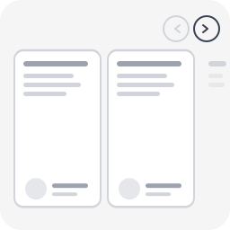
Snap Carousel
Most WordPress carousel plugins load heavy libraries (Slick, Swiper, jQuery) and fail basic accessibility checks. Screen readers can’t navigate them, keyboard users are stuck, and WCAG audits flag them every time. Snap Carousel takes a different approach: CSS scroll-snap does the scrolling, proper ARIA attributes do the rest. No JavaScript library, no configuration panel, no learning curve — just a block style to apply in one click. Built by WeAre[WP], a WordPress agency specializing in accessible websites and RGAA audits. This plugin exists because we needed a carousel that actually passes our own audits. Supported blocks Apply any of the 4 carousel styles to: Group block (core/group) — any child blocks become slides Query Loop block (core/query) — posts scroll as carousel slides Gallery block (core/gallery) — images scroll as carousel slides Variants Carousel (3 items) — 3 visible items + peek Carousel (1 item) — full-width slideshow Carousel (2 items) — 2 visible items + peek Carousel (4 items) — 4 visible items + peek Features 100% CSS scroll-snap — no Slick, no Swiper, no jQuery Prev/next navigation buttons Keyboard navigation (Arrow keys, Home, End) Full ARIA attributes (role=”region”, aria-roledescription, aria-live) Peek effect: partial visibility of the next item, signaling scrollable content Responsive (auto tablet/mobile adaptation) Respects prefers-reduced-motion Works with Group, Query Loop, and Gallery blocks Works with any child block (images, columns, groups, WooCommerce…) Lightweight: ~2 KB CSS + ~2 KB JS, zero external dependency Full RTL (right-to-left) language support Fully internationalized (i18n ready, French translation included) Easy to customize via CSS custom properties or overrides Accessibility (WCAG 2.2 AA) role="region" + aria-roledescription="carousel" on the container role="group" + aria-roledescription="slide" on each item aria-label="X of Y" for position context tabindex="0" for keyboard focus aria-live="polite" to announce changes Buttons with aria-label and aria-controls Touch targets 44×44px minimum Visible focus indicator Usage With a Group block In the editor, create a Group block Set the group layout to Row Add child blocks (images, groups, columns…) In the sidebar panel → Styles → choose Carousel (3 items) (or another variant) Publish With a Query Loop block Insert a Query Loop block Configure the query (post type, filters, number of items…) In the sidebar panel → Styles → choose a Carousel variant Publish — posts scroll horizontally as carousel slides With a Gallery block Insert a Gallery block and add images In the sidebar panel → Styles → choose a Carousel variant Publish — images scroll horizontally as carousel slides Navigation buttons and accessibility attributes are automatically injected on the front-end. Customization The carousel is designed to work out of the box, but you can easily override styles in your theme’s style.css or via the WordPress Customizer > Additional CSS. Disable the peek effect By default, items are slightly narrower than the visible area so the next item “peeks” in — signaling there is more content to scroll. To disable this and show full-width items: /* Disable peek — 3 items variant */ .is-style-snap-carousel > * { flex-basis: calc(33.333% - 1rem) !important; } /* Disable peek — 1 item variant */ .is-style-snap-carousel-single > * { flex-basis: 100% !important; } /* Disable peek — 2 items variant */ .is-style-snap-carousel-duo > * { flex-basis: calc(50% - 0.75rem) !important; } /* Disable peek — 4 items variant */ .is-style-snap-carousel-quad > * { flex-basis: calc(25% - 1.125rem) !important; } Customize navigation arrows /* Arrow color and background */ .snap-carousel-prev, .snap-carousel-next { background: #0073aa; color: #ffffff; border-color: #0073aa; } /* Arrow hover state */ .snap-carousel-prev:hover, .snap-carousel-next:hover { background: #005177; color: #ffffff; } /* Arrow size (default: 44px — WCAG minimum touch target) */ .snap-carousel-prev, .snap-carousel-next { width: 48px; height: 48px; } /* Square arrows instead of round */ .snap-carousel-prev, .snap-carousel-next { border-radius: 8px; } Customize spacing /* Gap between items */ [class*="is-style-snap-carousel"] { gap: 2rem; } /* Space above carousel (room for navigation) */ .snap-carousel-wrapper { padding-top: 4rem; } Customize focus indicator /* Custom focus color for keyboard navigation */ [class*="is-style-snap-carousel"]:focus-visible { outline-color: #ff6600; outline-width: 3px; } .snap-carousel-prev:focus-visible, .snap-carousel-next:focus-visible { outline-color: #ff6600; } Use with WordPress theme.json design tokens The carousel already uses --wp--preset--color--base, --wp--preset--color--contrast and --wp--preset--color--primary tokens. You can override these per-block in theme.json or via CSS: /* Example: dark themed carousel */ .snap-carousel-wrapper { --wp--preset--color--base: #1a1a2e; --wp--preset--color--contrast: #e0e0e0; --wp--preset--color--primary: #e94560; } Technical Notes – CSS overrides flex-wrap: nowrap on the Row container to force horizontal scrolling – Items use a slightly reduced flex-basis to create a peek effect (next item partially visible) – Navigation buttons are positioned absolute at the top right (adjust top value for your theme) – JS uses a 150ms debounce on scroll for button state updates and 300ms for screen reader announcements – Compatible with WooCommerce blocks (products, etc.) About Snap Carousel is built and maintained by WeAre[WP], a French WordPress agency specializing in accessible websites and RGAA compliance audits. This plugin was built to solve a real problem: every carousel plugin we audited failed basic accessibility requirements. So we built one that passes our own audits. Need help with your WordPress project? Get in touch.