Shortcodes Ultimate – Content Elements
Shortcodes Ultimate is a WordPress shortcode plugin for adding tabs, accordions, buttons, FAQs, sliders, carousels, lightboxes, columns, boxes and other reusable content elements without coding. It is ideal for site owners who want richer content layouts and practical UI elements without switching to a full page builder. Use Shortcodes Ultimate in the Block Editor, Classic Editor, widgets and template files. Generate shortcodes visually, preview the result before inserting it, and reuse the same elements across posts, pages and existing shortcode-based content. Trusted by hundreds of thousands of WordPress sites, Shortcodes Ultimate helps you replace multiple single-purpose UI plugins with one maintained toolkit. Explore live examples What you can build With Shortcodes Ultimate, you can quickly add common WordPress content elements such as: Accordions and FAQ sections Responsive tabs CTA buttons and download buttons Boxes, notes and callouts Columns and layout helpers Sliders and carousels Lightboxes for images and custom content Post lists and dynamic content blocks Spoilers, toggles and expandable content Media embeds and visual content blocks Instead of installing a separate plugin for every small content element, Shortcodes Ultimate gives you one maintained toolkit for everyday WordPress content tasks. Works with modern and classic WordPress workflows Shortcodes Ultimate works with the Block Editor, Classic Editor, widgets and template files. You can insert shortcodes manually, use WordPress shortcode blocks or use the built-in shortcode generator to configure elements visually. This makes the plugin useful for: Site owners who want to improve content without coding Bloggers and affiliate publishers who need reusable CTA and content blocks Agencies and freelancers maintaining multiple WordPress sites Developers who want shortcode-friendly output in templates Existing sites with older content that already uses shortcodes Why use Shortcodes Ultimate? 50+ ready-to-use WordPress shortcodes Visual shortcode generator Live preview Works with the Block Editor and Classic Editor Shortcodes can be used in posts, pages, widgets and template files Responsive elements that work with your theme Built-in Custom CSS editor Developer-friendly hooks and documentation Free version available on WordPress.org Pro version available for advanced shortcodes, extra styles and premium support Why shortcodes still matter in WordPress The WordPress Block Editor is great for visual content editing, but shortcodes are still useful when you need portable, reusable content elements that work across different parts of a WordPress site. Shortcodes are especially helpful when you want to: Reuse the same content element in many posts or pages Add dynamic content inside widgets or templates Maintain older WordPress sites that already use shortcodes Work across Classic Editor and Block Editor workflows Add content elements without switching to a full page builder Keep common UI elements available through a simple text-based syntax Shortcodes Ultimate is designed for these practical workflows. It gives you a large collection of ready-made shortcodes and a visual generator, so you do not need to write shortcode syntax manually unless you want to. Free and Pro The free version of Shortcodes Ultimate includes a large collection of useful shortcodes for everyday WordPress content tasks. Shortcodes Ultimate Pro adds advanced shortcodes, additional styles, Content Slider, Pricing Table, Testimonials, Shortcode Creator, Elementor support and premium support. Compare Free and Pro Useful links Documentation Live Examples Pro features Support
Top keywords
- shortcodes23×4.36%
- content20×3.79%
- wordpress14×2.65%
- editor10×1.89%
- shortcodes ultimate10×1.89%
- ultimate10×1.89%
- elements9×1.70%
- shortcode6×1.14%
- block5×0.95%
- block editor5×0.95%
- classic5×0.95%
- pro5×0.95%
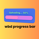
WBD Progress Bar
The Progress Bar block is a simple yet powerful tool for displaying progress, statistics, skills, or any percentage-based data on your WordPress site. Built with modern web standards, this block offers smooth animations and a clean, professional appearance. Whether you need a simple skill bar, an animated number counter, a circular radial ring, or a full skills section — WBD Progress Bar has you covered. Features Display Modes * Single Bar – Classic horizontal progress bar with full customization * Number Counter – Animated count-up effect with prefix, suffix, and optional bar below * Circular / Radial Progress Bar – Beautiful SVG ring-style progress with 10 themes, custom size, stroke width, center text, and optional label * Group / Skills Section – Display multiple progress bars together as a skills list with individual labels, colors, and percentages; flexible label & percentage positioning 10 One-Click Template Styles Ocean Blue, Sunset Fire, Forest Green, Purple Galaxy, Golden Hour, Midnight Dark, Rose Pink, Arctic Ice, Corporate Gray, Lemon Lime Customization * Progress percentage control (0–100) * Custom fill & track colors * Gradient fill (two-color gradient) * Bar corner radius control (square to pill) * Bar height control (6px–40px) * Optional percentage text display * Percentage position — Inside bar / Outside right / Above bar * Label position — Above / Below / Inline row * Inline gap control (when label is inline) * Milestone marker with custom label * Hover tooltip on progress bar * Scroll-triggered animation (IntersectionObserver) * Animation type — Ease, Ease In, Ease Out, Ease In Out, Linear, Bounce, Elastic * Animation duration control * Typography control — Font family & font size for label and percentage text * Fully responsive design * Accessible design with semantic HTML Perfect For: Skill & competency display Project completion indicators Goal tracking & fundraising Statistics & data visualization Survey results & polls Resume / portfolio pages The block provides an intuitive editing experience with sidebar controls for adjusting the percentage (0–100), customizing colors, toggling percentage text visibility, and selecting from predefined style variations. Why Use WBD Progress Bar? Most progress bar plugins are either too bloated with unnecessary features or too simple to be actually useful. WBD Progress Bar is built differently: 🚀 Performance First The block outputs pure static HTML and CSS — no jQuery, no heavy JavaScript libraries. The frontend script only loads when your block is actually on the page, keeping your site fast. 🎨 Visual Flexibility Four display modes, five style variations, ten one-click templates, gradient fill, custom radius, custom height, and full color control — all without touching a single line of code. 🧩 Built for Gutenberg This is a native WordPress block, not a shortcode or widget. It works seamlessly inside the block editor, Full Site Editor (FSE), reusable blocks, and block patterns. 📱 Responsive by Default Every mode — single bar, counter, circular, group — adapts automatically to mobile, tablet, and desktop screens without extra configuration. ⚡ Scroll Animation Without a Plugin Built-in IntersectionObserver-based scroll trigger animates your bars when they come into view. No extra animation plugin needed. Source Code & Build Instructions Source Code Repository: https://github.com/wpbranddigital/wbd-progress-bar This plugin is built using @wordpress/scripts (webpack). The compiled/minified files in the build/ directory are generated from the human-readable source files located in the src/ directory of the plugin. Source files included in this plugin: src/index.js — Block registration entry point src/edit.js — Editor component (block inspector controls and editor preview) src/save.js — Save component (frontend HTML output) src/view.js — Frontend JavaScript (scroll animations, counter animations) src/block.json — Block metadata and attribute definitions src/editor.scss — Editor-only styles src/style.scss — Frontend styles To build from source: Make sure you have Node.js (v18+) and npm installed. Navigate to the plugin directory. Run npm install to install dependencies. Run npm run build to generate the production build/ directory. Run npm start to start the development watcher with live rebuild. The only build dependency is @wordpress/scripts (see package.json). How To Use Step 1 — Add the Block Open any post, page, or template in the WordPress editor. Click the + block inserter button, search for “Progress Bar”, and click to insert the WBD Progress Bar block. Step 2 — Choose a Display Mode In the right sidebar, find the Block Mode panel at the top. Select one of four modes: Single Bar — A classic horizontal progress bar. Best for individual skills, project completion, or goal tracking. Number Counter — An animated number that counts up on scroll. Great for statistics pages (“500+ clients”, “$1M+ revenue”). Circular / Radial — A circular SVG ring progress indicator. Perfect for dashboards or visual KPI displays. Group / Skills Section — Multiple bars stacked together. Ideal for resume skills sections or comparison lists. Step 3 — Apply a Template (Optional) Open the Template Styles panel and click any of the 10 preset templates to instantly apply a complete color scheme and style. You can fine-tune colors individually after applying a template. Step 4 — Customize Settings Depending on your selected mode, configure the following panels: Progress Settings — Set percentage, height, radius, label text, label position, and percentage position. Animation — Choose animation type (ease, bounce, elastic), set duration, and enable scroll-triggered animation. Milestone & Tooltip — Add a milestone marker at any percentage point with a custom label. Enable hover tooltip for additional info. Typography — Set font family and font size for the label and percentage text independently. Color Settings — Set fill color, track color, label color, and percentage text color. Enable gradient fill to use two colors. Step 5 — Using the Number Counter Switch to Number Counter mode. Set: Target Number — The final value to count up to (e.g. 1500). Prefix — Text before the number (e.g. $). Suffix — Text after the number (e.g. + or %). Label — A description shown below the number (e.g. “Happy Clients”). Show Progress Bar Below — Toggle to add a bar underneath the counter. The counter animates automatically on page load, or enable Animate on Scroll so it only starts when the user scrolls to it. Step 6 — Using Group / Skills Section Switch to Group / Skills Section mode. In the sidebar: Each bar item has its own Label, Percentage, and Bar Color. Click + Add Bar to add more items (no limit). Click ✕ to remove any item. Set Label Position — Above bar (with optional percentage on the same line) or Inline row. Set Percentage Position — Inside bar / Outside right / Same line as label. Adjust Gap Between Bars and Inline Gap sliders to control spacing. Step 7 — Using Circular / Radial Mode Switch to Circular / Radial mode. In the sidebar: Choose one of the 10 circular themes by clicking the theme thumbnail. Adjust Size (80–300px) and Stroke Width (3–20px). Set the Progress Percentage. Toggle Show Label Below to display a text label under the ring. Fine-tune Stroke Color, Track Color, and Center Text Color individually. Step 8 — Publish Click Publish or Update. The block renders as clean, static HTML on the frontend with no extra requests or render-blocking scripts. Where can I get support? Visit our contact page for support.