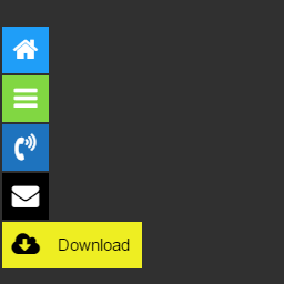
Float menu – awesome floating side menu
Try Free Demo | 🚀 Try Pro Demo | Documentation Float Menu is a free WordPress plugin to create and place a unique floating menu on your website. The extension allows users to get access to the functions of the panel regardless of its position on the resource. The menu moves along with the scrolling of the page and always remains in visibility. 🌟 Features: Floating menu that stays on the screen. Lightweight & fast – does not slow down your site. Easy customization – change colors, icons, and position. Works with any WordPress theme. ✅ Enhance usability and user experience with Float Menu! — Main features The Float Menu makes user interaction with the site more comfortable. It can increase the conversion by improving the functionality of the web resource. Among the capabilities of the tool: 🎨 Customization & Design Create unlimited menus. Horizontal or vertical menu layout. Position menu left or right. Choose from 4 button shapes: Square, Round, Rounded, Rounded-out. Adjust spacing between menu items. Set custom colors for buttons and icons. Use 2000+ Font Awesome 7 icons. Load demo configuration – get started quickly with pre-made examples. Test Mode – show the menu only to administrators while configuring settings. 🔗 Link & Accessibility Options Open links in a new window. Set custom attributes: ID, Class, rel, aria-label. Hide the menu on small or large devices. ⚡ Performance & SEO Lightweight and fast – does not slow down your site. SEO-friendly structure for better indexing. — 🚀 Ideal Uses Float Menu is highly versatile and can be used for various scenarios: – Instant Messaging: Add quick-access buttons for WhatsApp, Telegram, Skype, or Messenger. – Floating CTA: Keep “Book Now” or “Get a Quote” buttons always visible to boost sales. – Mobile App Experience: Create a professional bottom or side navigation bar for mobile users. – Quick Support: Provide easy access to your Help Center, FAQs, or Support tickets. – Anchor Navigation: Build a floating table of contents to navigate between long page sections. – Social Presence: Link to your Instagram, Facebook, LinkedIn, or TikTok profiles. – Membership Access: Quick links for Login, Register, and User Account pages. – Special Offers: Highlight time-limited promotions or discount codes. — Pro Version Unlock advanced features and take your floating menus to the next level with Float Menu Pro! 🎨 More Customization Create submenus – supports a single submenu level. Hold label open – keep menu labels visible. Vertical alignment – align menus precisely. Extra text & label fonts – display detailed descriptions with custom fonts. Custom icons – upload your own icons. Icon settings – rotate, flip, and customize icons. 🔗 More Functional Links Translate page – one-click website translation. Social sharing – share content via Facebook, Twitter, etc. Next/Previous Post – quick navigation between posts. Forced download – enable direct file downloads. Smooth scrolling – scroll to sections effortlessly. Scroll to top/bottom – quick page navigation. Print page – allow users to print the current page. Search integration – add search functionality to the menu. 🎯 More Display Rules Show/hide based on scroll – smart visibility control. User role permissions – restrict menu by user role. Multilingual support – adjust menus per language. Schedule menu display – control when menus appear. Activate by URL – display menus only on specific pages based on URL parameters. Activate by referrer URL – show menus based on where users came from. 📊 Analytics & Performance Google Analytics tracking – track menu interactions and clicks. Browser compatibility control – hide menus for outdated browsers. 🔥 Bonus Feature: Built-in Popup System Create popups – trigger popups when clicking menu items. 👉 Upgrade to Pro and unlock all premium features! — 🚀 Maximize Results with Complementary Plugins Enhance your website’s functionality and user engagement by combining Float Menu with these powerful tools from Wow-Company: Popup Box (Modal Windows) – Create stunning popups and triggers for your menu items to boost conversions. Counter Box – Easily add counters, timers, and countdowns to highlight urgency and events. Calculator Builder – Build custom interactive calculators for lead generation or user utility. WP Coder – Add custom HTML, CSS, PHP, and JS code snippets to your site and menus easily. Herd Effects – Use social proof notifications to increase user trust and performance. 👉 Explore all plugins by Wow-Company Support Search for answers and ask your questions at support center
Top keywords
- menu21×3.15%
- menus9×1.35%
- user8×1.20%
- custom6×0.90%
- float6×0.90%
- float menu6×0.90%
- icons6×0.90%
- page6×0.90%
- floating5×0.75%
- support5×0.75%
- add4×0.60%
- display4×0.60%
Responsive Navigation Block
This Plugin allows you to display and apply alternative styling to different navigation menus based on the screen size using the WordPress Navigation block. Video Walkthrough Features Two new Navigation Block (variations) for: Mobile Desktop Style your menu differently depending on screen size. Use a different menu for each screen size. Customize the “breakpoint” (where you switch between mobile and desktop). Automatically switch editor to “mobile” preview when editing the mobile navigation. Usage This Plugin creates two block variations from the Navigation block which will be automatically hidden/shown at the configured screensize (breakpoint): Navigation (Mobile) – will be displayed only on smaller screen sizes. Navigation (Desktop) – will be displayed only on larger screen sizes. This affords the ability to independently style mobile vs desktop navigation and even allows for completely different menus to be used. The Plugin should be used as follows: Install and Activate the plugin – two new block variations will be automatically registered for “Mobile” and “Desktop”. Go to the Editor and remove any existing Navigation block. Add the “Desktop Navigation” block – style and configure the menu for “desktop” as required. Add the “Mobile Navigation” block – style and configure the menu for “mobile” as required. View the front of your website and resize your browser to see the navigations swap out at the appropriate breakpoint/screensize. Alternatively you can transform the default Navigation block to either Mobile or Desktop variations via the block’s interface. Support Please see FAQs. If you still have an issue please: check Github for existing Issue reports. (if none) then file a new Issue on Github Privacy Statement Responsive Navigation does not: use cookies. send data to any third party. include any third party resources. Contributing Contributions to this Plugin are welcome. Please fork the Github repository and submit a PR for review. Development Setup This Plugin uses the @wordpress/scripts package. Check out the Github repo into the wp-content/plugins directory of a WordPress installation. cd into the Plugin’s directory install the dependencies with npm i. Running npm start will start the @wordpress/scripts package in watch mode ready to compile the JavaScript on modification. PHP files can be edited in the usual manner. Testing The Plugin has e2e test coverage for the key features courtesey of @wordpress/scripts and Playwright. To run the tests – in your terminal of choice: npm run build. npm run wp-env start. Run the tests: npm run test:e2e Releasing Releasing the Plugin to the WordPress.org Plugin repo is the prerogative of the Plugin owner (@get_dave). The process is as follows: Test the Plugin Commit all changes to trunk branch. Push changes to trunk (only) – git push origin trunk. In Github: Actions Select the Build Release Zip action. Select the Run workflow dropdown and run the workflow to generate a zip file. When action completes download the generated Plugin zip artifact. Manually install and test the .zip. Deploy to WP.org When ready to deploy. Bump Plugin version and tag release – npm run bump-version. Push trunk and tags – git push origin trunk --tags Deployment to WP.org will be handled automatically.